Recently I stumbled up the work of Edwin Tufte.
After reading it, I understood why most public policy communication can be better communicated by good visualisation rather than data dumps and words.
Even if an image / picture tells a thousand words, writing 2 pages of A4 is still the common path. I’m not sure it is the most informative or persuasive.
I’m going to list good examples of visuals that tell the story clearly.
Here are some.
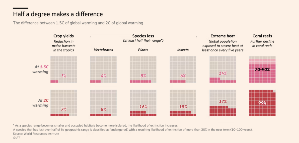
Source: FT – Link
[pdf-embedder url=”https://www.aaronmcloughlin.com/wp-content/uploads/2023/03/Decline-in-Crime-Around-the-Country-Graphic-NYTimes.com_.pdf” title=”Decline in Crime Around the Country – Graphic – NYTimes.com”]
Source: NYT – Link
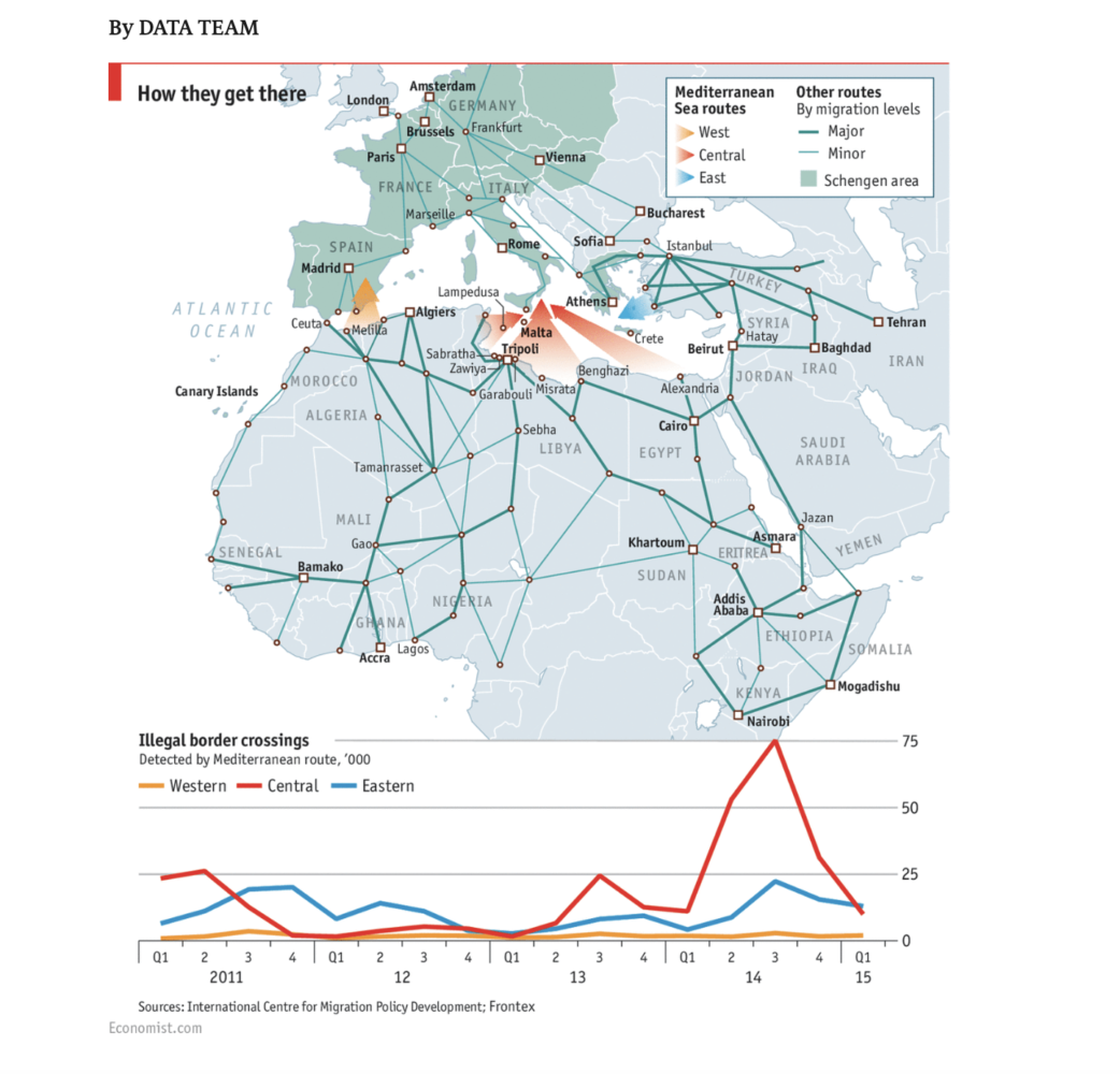
Source: Economist – Link
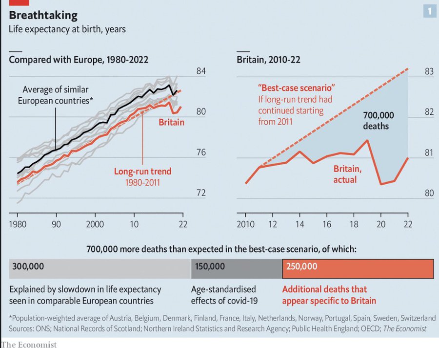
Source: The Economist
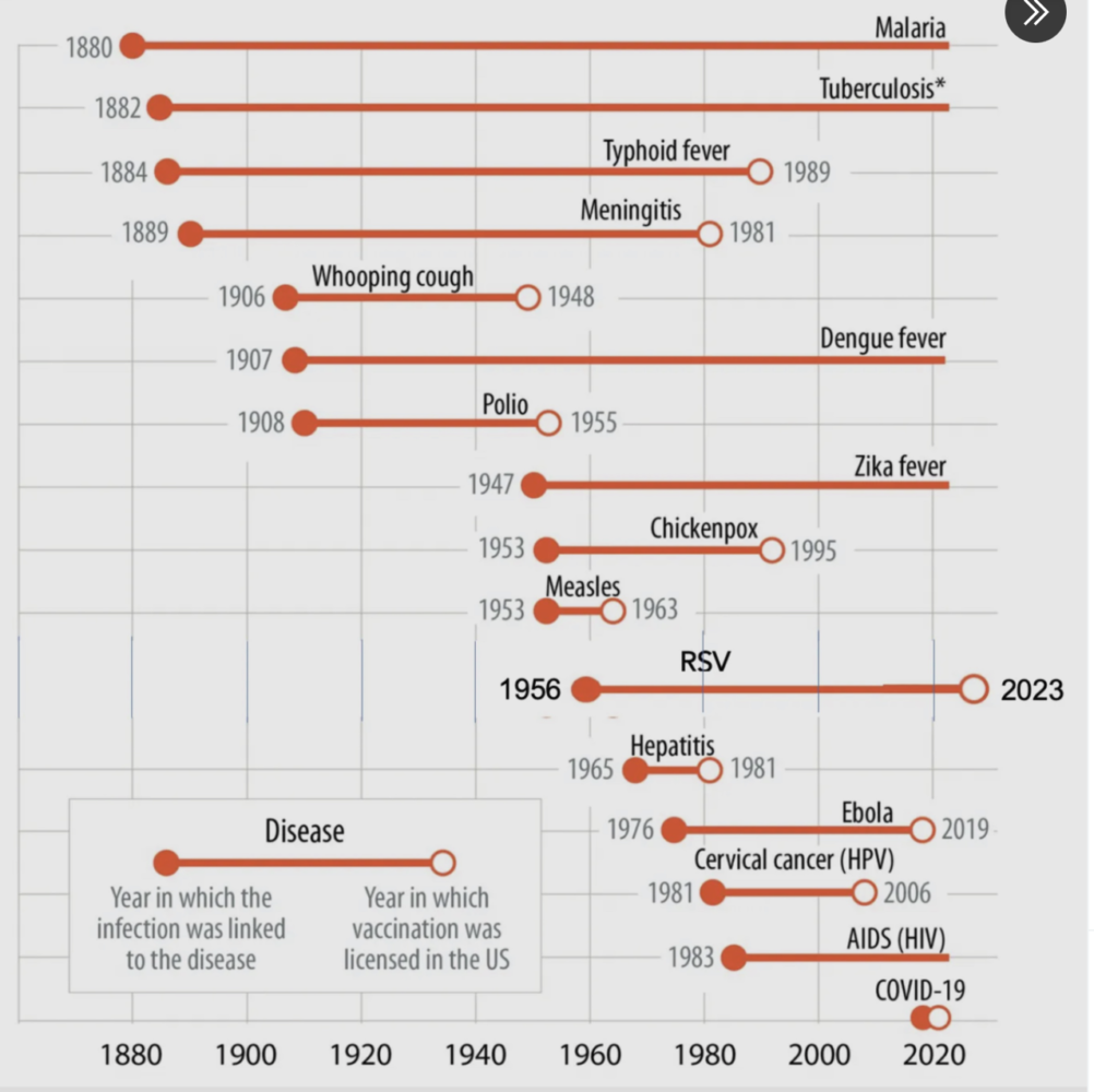
Source: Eric Topol @EricTopol
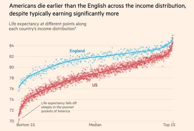
Source: John Burn-Murdoch. FT.
If you come across some, please send me the image, source and reference link.